Bridger Brewing | Packaging Design


Illustration Look Alike
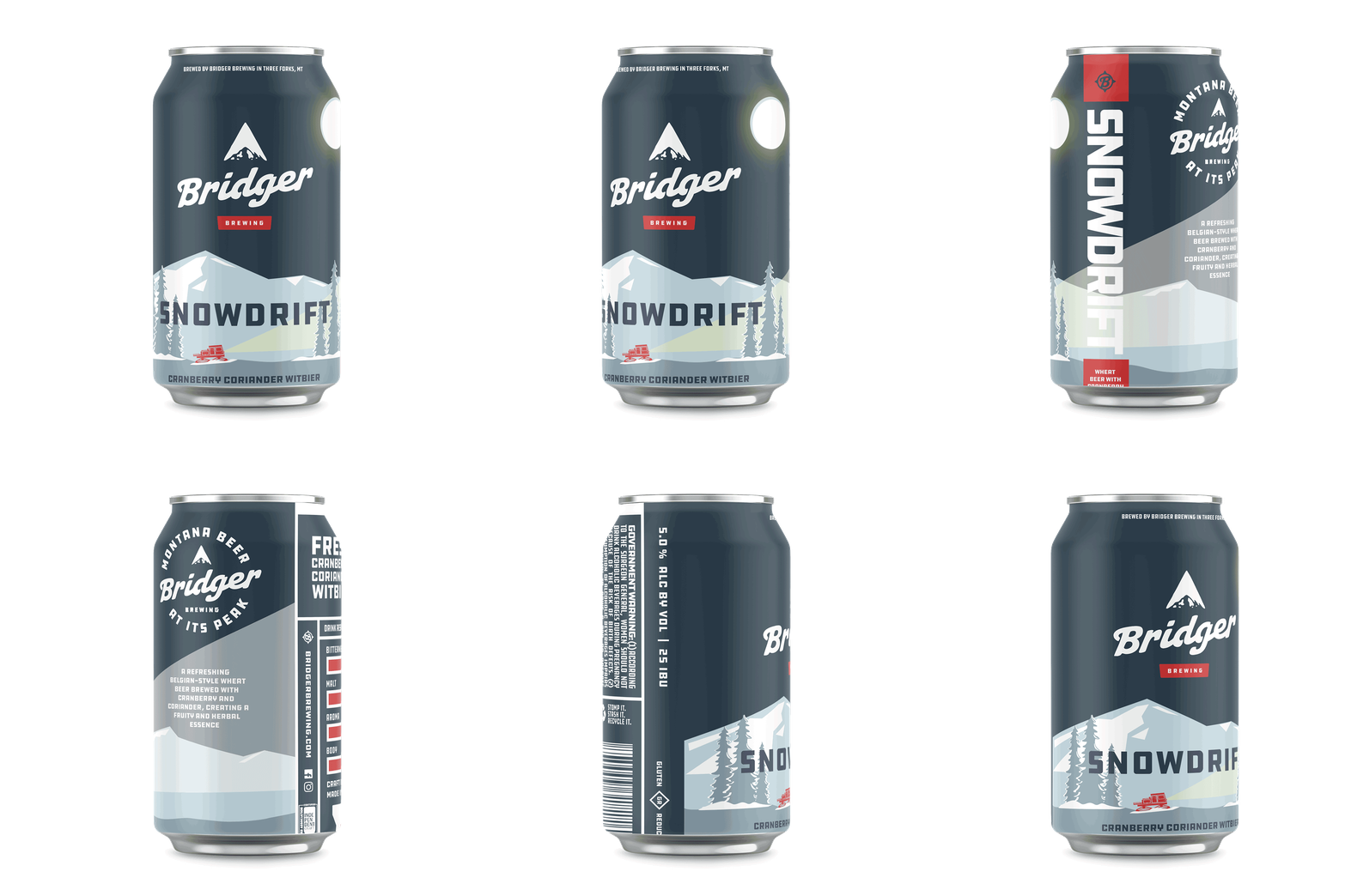
For this project, I designed a beer package inspired by Bridger Brewing’s signature illustration style. I took cues from their layered mountain scenes, muted color palette, and bold type to create something that feels like it fits right alongside their lineup, while still being my own take.
I came up with an original beer, Snowdrift—a cranberry coriander witbier—
and built the visuals around that idea. The snowy landscape and alpine vibe tie into the name and flavor, giving it that crisp, outdoorsy feel that Bridger is known for.
I also made sure the design works like a real product, not just a concept. It includes all the important details you’d expect on a can—flavor notes, bitterness, aroma and body indicators, ABV, government warning, barcode, and more. The goal was to keep it visually strong while making sure it’s practical and believable as something you’d actually see on the shelf.